“Creating a Hop takes too much work.”
A month after launching,
we realized a lot of people didn't understand what a Hop was and how to post one. The compose experience was too heavy and required too much time and effort investments. Creating a Hop was overwhelming and discouraging. All users wanted, was a simple way to tell their friends they were free and that they wanted to hang out. So we went back to the drawing board. Did friends really need to see where their friend wanted to hangout? Did that friend have to declare a set place? What were the stickers for? Did stickers help people understand the context of the hangout more? If someone tagged a friend, did that mean only friends could see it or would the public feel dis-included?
A Question-Driven Process:
- What do users actually want to shout out to their friends?
- What will motivate people to create content and complete the feedback loop?
- Can we simplify and strip down the compose feature to one-tap?
- How do people read and use the map to meet up with their friends?
BRAINSTORMING:
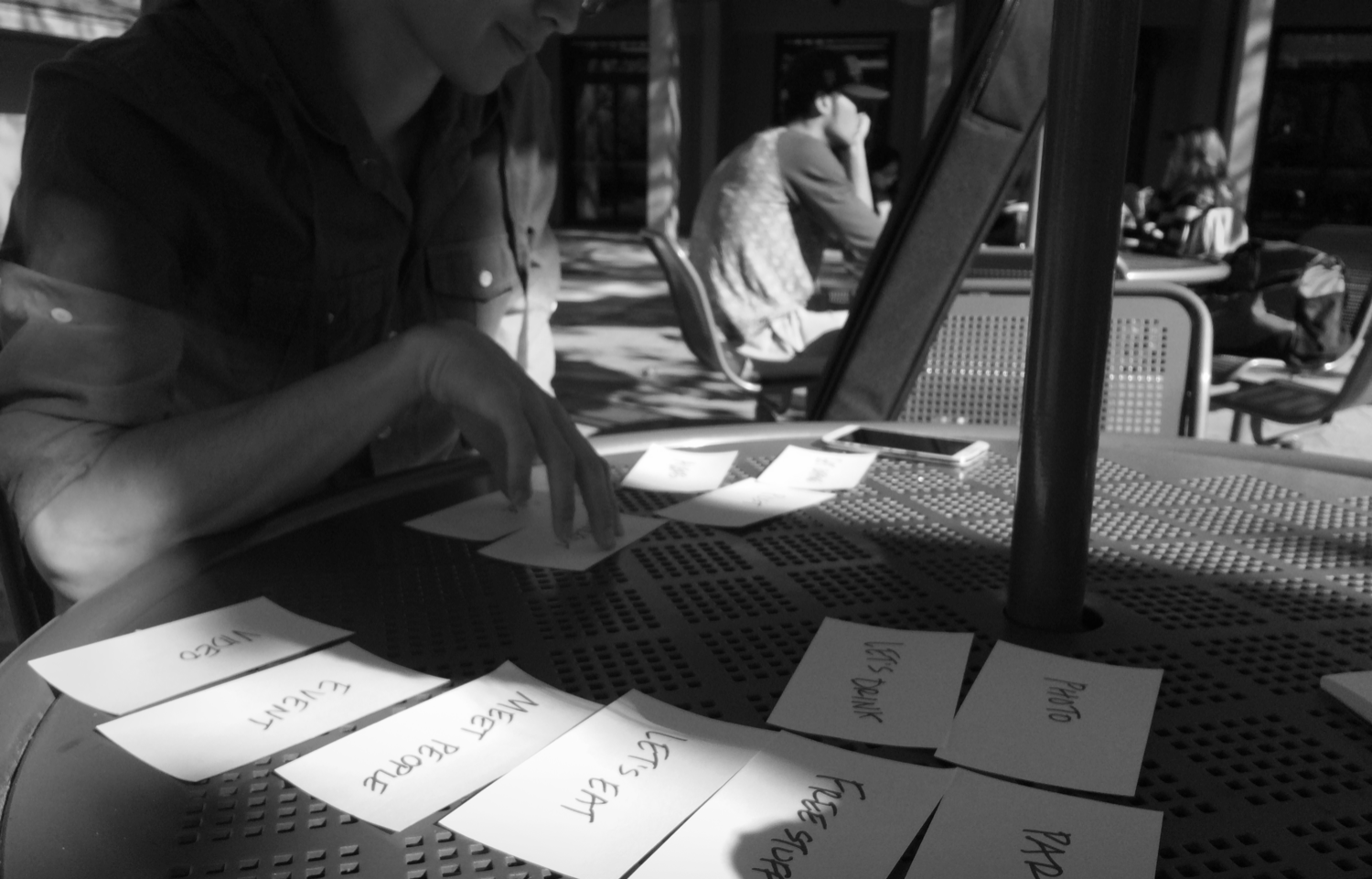
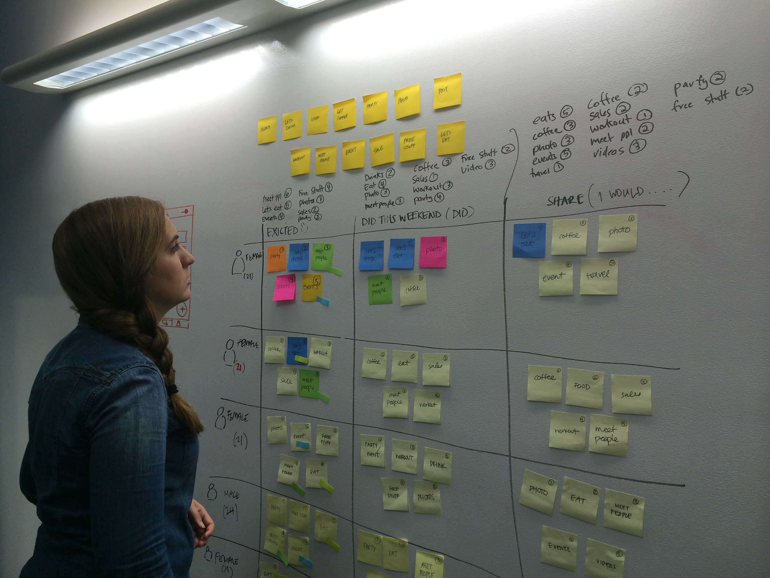
Since our team was comprised of mostly young, spunky, 20-something year-olds, we began brainstorming what we, as direct users, wanted to post on a map or broadcast to friends. We used post-its to brainstorm, grouped them into themes, took the top 10 options and then conducted a card sorting exercise with students at a local community college.
WITH NEW INSIGHT, WE BEGAN TO SKETCH...
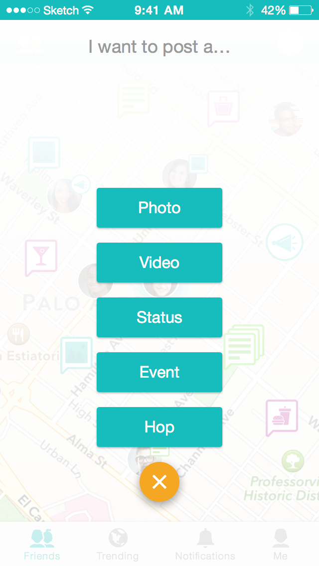
From our data, we saw very few people creating Hops and even fewer people actually meeting up. There could be several reasons why, ranging from product design to behavioral patterns. First, let's take a look at the screens...
NOTE: the screens above are old high-fidelity wireframes to illustrate how to compose a Hop. The visual design went through another pass before launching on the App Store.
Clearly, it took a lot of work to compose a Hop that simply broadcasts you want to hang out with your friends, so we had to change it.
COMPOSE RE-DESIGN


Identified Problems
- "No one else is on the map that I know" (Cold start problem)
- "So everyone can see where I am all the time?" (Privacy concerns)
- "Creating a 'Hop' takes a lot of work" (Too complex of a design)
With these challenges in mind, we sought to create an even better iteration of HopOver, aiming to make things more: